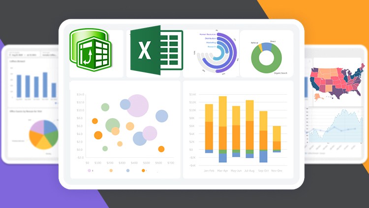
Advanced Microsoft Interactive and Dynamic Excel Dashboard
- Description
- Curriculum
- FAQ
- Reviews

Advanced Excel Dashboard Creation
Description:
Take your Excel skills to the next level with our Advanced Microsoft Interactive and Dynamic Excel Dashboard course. Excel dashboards are powerful tools for visualizing data and making informed decisions, and this course will equip you with the knowledge and techniques needed to create interactive and dynamic dashboards that impress and inform. From advanced data visualization to interactive features, you’ll learn how to design and build professional-grade dashboards that drive insights and facilitate data-driven decision-making.
Whether you’re a business analyst, financial professional, or data enthusiast, this course is tailored to help you unlock the full potential of Excel for dashboard creation. Through hands-on tutorials and real-world examples, you’ll gain practical experience in building dynamic dashboards that meet the needs of your organization or clients.
Requirements:
Participants should have a solid understanding of Excel fundamentals, including functions, formulas, and data manipulation techniques. Familiarity with basic data visualization concepts and Excel features such as PivotTables and Charts is recommended. Access to Microsoft Excel (preferably Excel 2016 or later) and a computer with internet access is necessary to complete the course exercises.
Who this course is for:
– Business analysts seeking to enhance their data analysis and visualization skills to create impactful dashboards.
– Financial professionals looking to improve reporting processes and present data in a compelling and interactive format.
– Data enthusiasts interested in learning advanced Excel techniques for dynamic dashboard creation to showcase insights and trends effectively.
In this course, you’ll:
– Explore advanced Excel features and techniques for building interactive and dynamic dashboards.
– Learn how to create dynamic charts, slicers, and interactive elements to enhance dashboard usability.
– Discover best practices for designing visually appealing dashboards that effectively communicate insights.
– Gain practical experience through hands-on projects and case studies, applying learned concepts to real-world scenarios.
– Master the art of storytelling with data, leveraging Excel dashboards to present findings and drive decision-making.
Enroll now to elevate your Excel skills and become proficient in creating advanced interactive and dynamic dashboards!
-
7Project Overview
-
8How to Activate Microsoft Excel Power Pivot
-
9Importing data into Power Query
-
10Power Query Transform vs Add Columns explained
-
11Importing Multiple tables into Power Query
-
12Updating your current Workbook Settings to get proper Dates and Time
-
13Checking errors and remove columns and rows in Power Query
-
14How to add Index number in Power Query
-
15Merging Queries in Power Query
-
16Basic way to Append Queries
-
17Best way to Append Queries using Folder with Auto Update
-
18Creating a Custom Calendar Table in Power Query
-
19Better way to Create a Date Table in Power Query (Auto Update)
-
20How to Move data into Power Pivot from Worksheet
-
21Important Data Source Settings in Power Query
-
22Data view vs Diagram view
-
23Understand Database Normalization
-
24Creating Relationships in Power Pivot
-
25How to Edit Relationships in Power Pivot
-
26Power Pivot view vs Normal Excel Pivot Table
-
27Power Query and Data Modelling conclusion
-
28Introduction to DAX in Excel Power Pivot
-
29How to add DAX Calculated Column
-
30Calculated Column with Dax If function
-
31Calculated Column with Dax Switch function
-
32Total Revenue with Calculated Column
-
33Introduction to DAX Measures in Power Pivot
-
34How to write DAX using the Measure BOX
-
35Implicit vs Explicit Measures
-
36How to create a Separate Measures Table
-
37How to calculate COGS and Gross profit
-
38Calculating returned Rate using DAX
-
39How to use DAX All Function
-
40How to use the DAX Filter Function
-
41Filtering Table with DAX Function
-
42How to mark your Date Table
-
43Time Intelligence YTD MTD and QTD DAX Function
-
44Last month Revenue and MoM percentage Change
-
45How to calculate 10-Days Rolling total
-
46How to calculate 10 Days Transactional Average
-
47Better to Count using DAX
-
48Dashboard overview
-
49Setting Dashboard Canvas
-
50How to add M-Code, Last Update date code
-
51Adding values to cards
-
52Adding Icons
-
53Adding new cards with Gradient colors
-
54How to create a Dynamic Top N in Excel
-
55Creating a dynamic Title
-
56How to create multiple Doughnut chart
-
57Inserting a Bar charts
-
58How to create a Map chart
-
595 Less and Top Profitable Cities
-
60How to connect Slicers to PivotTables
-
61Dashboard Overview
-
62Transforming and Cleaning data with Power Query
-
63Inserting PivotTable and Advanced Number formatting
-
64Adding Month Filter
-
65Dynamic way to show previous Month revenue with Percentage Change
-
66Quantity Ordered and Transaction Cards
-
67Which Product contributed more to Revenue
-
68Which State should we push more Products to?
-
69What is the peak month for 2020 and 2021?
-
70What's our top Region & Sales Channel?
-
71Revenue trend by Weekday
-
72Connecting Slicers to PivotTables
-
73How to create a Single Button that clear all filters
-
74New way to save your work
-
75Formatting Slicers
-
76Cleaning up your dashboard


